Thursday 29 March 2007

matt sewell


Matt Sewell's page is exactly the type of site that i would like to make it is easy to navigate, the color's that make up the site are inviting and calming as well, but it still retains Sewell's style.

it doesnt have a scroll bar!! I have become quite obsessed with the notion of no scroll bar as they are a pain, you dont wont to be scrolling your finger down endlessley to get to the bottom of your page, the page i feel should presented as something that snaps to your screen.


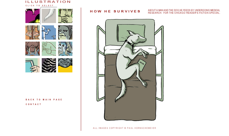
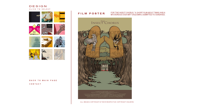
His photographs of his work are spaced out into individual squares which then pop up into a new framed window with the navigation banner above, i would prefer to have my mine images appear on the same page, like an image swap, this enables people to view the images at a nice size without them getting the full image so they cant just print it off.


Inserting anchor points and testing links between pages, i created a roll over but i want the images to stick, so i began to experiment with swap images, but they still apear to be like roll overs i would prefer the images to be uploaded on click
rather than when you just roll over.

Tuesday 6 March 2007

http://www.limbogame.org/


Photobucket - Video and Image Hosting


Photobucket - Video and Image Hosting


again a simple navigation is something that i would like to on my portfolio website, this is even more simplistic as it has about 8 link points and one pop up window for contact via email


www.margomitchell.com

A portofilio website that is simple to navigate around, the index page offers two main options of work, illustation and design. Offering a contact button in the middle leaves the viewer with ease once they have seen everything to simply hit the index button and naviagte back to the start menu.


Photobucket - Video and Image Hosting


Photobucket - Video and Image Hosting


Photobucket - Video and Image Hosting


One of the main reasons as to why this website is so easy to naviagte around is you dont have to scroll down at all. call me lazy but i hate that scroll button.


another aspect that works really well with the portfolio of work is the way that their are small images on the left hand side which can simply be clicked and upload on the right hand side larger, it does this without a new window popping up.