..
>
Eval
I feel I have completed the task extremely well, a lot of the website I spent a lot of time on my own trying to figure out and I am really glad that I have done this, as this has developed my skills in understanding HTML as I have begun to edit the entire site from code rather than on dream weaver, repairing links when people have said they are broken, and adding more information.
After completing my site, I began to realize during the process of uploading it that I really needed too order my files correctly and separate my Photoshop files and my html/jpeg files, this would make the whole process of uploading the images a seamless process.
One aspect I would definitely change of my website is the position of it, I would prefer it to be more central as it seems to stray a little over to the left, and this makes the page look like there is more too it than there is.
The update section also needs to be changed, I want to put a header above it that is a graphic that highlights it’s the ‘news section’ and then put a background within the DIV tag scroll bar, I have begun to scan in lined paper with splats of ink on it, as I feel this part looks a little bare in comparison to the rest of the site.
Another aspect that I am thinking of changing is adding words over the video section which some up each individual video as I am not entirely sure if it communicates well enough that each thumbnails is a video, this has not come up during audience testing most people complained about the double click option I put on everything, this really did throw people off and people said it didn’t work, I rectified this which resulted in viewers being extremely happy with the way the site runs.
In the contact section I am still undecided as too what to do with the text to the right as it feels a little clumsy at the moment, there is perhaps other sections that I am going to put in their such as a forum or a guest book something to where I can easily keep in touch with viewers of the site and they can let me know if there are any problems with it. This will enable me to create a better quality composition on the page and will compliment the image to the left.
When clicking on ‘contact’ it needs too say email in order too clearly state its purpose as at the moment the image just pops up and its unclear about whether or not you can click on it.
A splash page is something that I wanted to do after the web elective was over as I wanted to just get the structure right. The splash page would consist of an animation and given the time constraints I didn’t want to just come out with one page and nothing else, for this page I am going to start designing a flash animation which will set up the theme of the website.
Overall I feel I have achieved my initial aim which was I wanted to create a site that was extremely easy to update and navigate around, there are still a few objects that need re-arranging and I need to scan/print and upload the rest of my portfolio.
fag packs


with the smoking ban comming upon us i thought cig packets would be the perfect platform to advertise my website on,as they will become an increacingly odd thing too leave in a bar, so i propose too make the nets of a cigerate packet into characters this was only a prototype as i think i was drunk when i was making it, but it deffinatly can be done.
yoda yoda

another idea im going too use too promote involves plant pots, and plant tags, im going to put them everywhere with the web adress on the back but im going to do some quality vector based rabbits that go inside plant pots that are in art meauseams and coffee house peoples gardens everwhere where their is soil.


ive been doing these beer matt doodles for a long time now, and i figure they would be the perfect chance too promote the site, by having the address on the back and a little number too make them part of a collection, then i will get the finder to send a pic with them and the beer matt. these will go in the beer section, everytime i go into a bar im going to leave them on a table.

I asked a few people if their the website was working fine, and most agreed that they could see the whole thing, i know that i need to shift the box more to the centre as at the moment its too far too the left

i also realized that the freind section wasnt working correctly this was because id entered the worng link i didnt put http:// before the address which resulted in the link being faulty.

probally the biggest pain so far, has been uploading the website, everything was running fine until it came to going to www.rabbitportal.co.uk , the website company hosting my site kept comming up instead of my site. Their wasnt really a massive problem inb the end all i had to do was to change where the site would open up so instead of www.friedice.freebitty.com it had to be the index page it was set too.
At the moment im currently having problems making changes too the double click's on the website, as that has been the biggest complaint so far, i guess i was thinking of me instead as i useually tend to double click everything. this shouldnt take too long as its only the photography page and the illustration section oh and the video one that have this problem.


i wanted to create images for the site, this is only temp but ive decided to use this as an image for my contact section and then along side this im going to create a link that opens up, but i really dont want the terrible underlined blue text to come up with my email ad so im working on creating a pop up to come up on that page, which will have an image, i figure all you have to do is insert the image code in between the link html and this should work.


you can see here where i have changed the code to open an image which will then send you to your default email browser, from here people can either send me an email or copy and paste my email adress

i also i had to resize the browser window so it would fit the size of the image, im wanting to create a black border that will match up to the image.

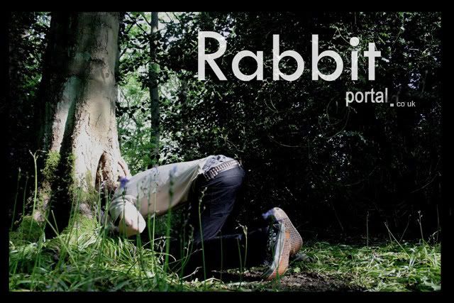
I wanted to create a nav bar which refelcted not only the websites name, but also i wanted to create something that would reflect my work, and i feel i did this extremely well here, its basically i photoshop file of 2 layers one is of a hole within a tree and i layerd a ripple on water over the top of this.
then added a tittle to this i did various different versions of this, However i felt that this was an extremely good representation of what i am about. I really need to change the apostraphe after in 'Present's' but ive already over laid it onto every page and i dont really have time to change this on photoshop.
NAV BAR


To begin with a started to create the nev bar entirely within image ready, i had two of the same bars and created roll overs and the links within image ready, so everything worked their and all i would simply have to do was insert the code into my dream weaver document. this however didnt work the nav bar would come up but the roll overs did not.


On photoshop i created a nav bar again that had already been sliced via image ready and i created two of the same nav bar one with white text and another with the opacity turned down. At first i encounted some problems with the quality of the graphic as it looked slightly gltichy and the quality was generally poor, so i changed the font to crisp and sharp, this gave it the quality i was looking for. from this i would insert the white nav bar into a table on dream weaver.so i could put the seperate sections up close together without their being any white gaps in between. and then set each sections link up so home would go to home etc.

using the image swap, which i talked abou earlier in the blog i used it again with my illustation section. I had encounterd a few problems to begin with, as the images were all the complete wrong size.

I went back into photoshop and changed all the image res sizes too 72, this was a complete pain but it also gave me the change to convert my images from layers into tables, this became a much easier way of arranging my images.
video swap

I wanted too post my video's on my website, however knowing that i would only be able too obtain a 5gb web space, i knew that i would have to use and alternative site that would host my videos. The obvious choice was to use youtube as it is quick and easy too use and its easy to acsess.
However i didnt want to have a dreict link to their site or have their nasty front cover thhat shows up before your video plays, so i created a new hmtl window, and used a image from the video, and upon click this would open up a pop up window whcih was the exact size of the video without taking the viewer away from the web site.


Subscribe to:
Posts (Atom)
