I need to find this.
Lots to update after I have enjoyed my well earned break :)
Tuesday, 25 December 2007
Saturday, 15 December 2007
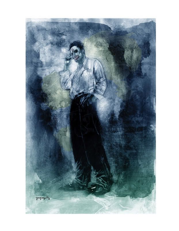
The dark night
Im really loving the new campaign for the new Batman movie, they have the tone of Batman bang on, and im so glad their having another stab at the joker and while , yes Nicholson was awesome as the Joker he wasn't 'the joker'


Wednesday, 12 December 2007
office blocks
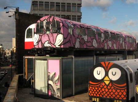
Not only do these offices use old subway cars they are on top of old buildings and regularly updated by graffiti artists, the Pink one is Insa's work.
stranger than fiction
I completely forgot to post this, studio mk12 have been a major influence upon my work as of late, its not just the stylistic qualities they use in after effects its their camera angles that they utilize to do so, this coupled with great sound work makes for compelling motion graphics.
Monday, 10 December 2007
HES BACK!
Well my child hood hero has come back not optimus. He may be as old as my dad but god damn hes cool as fuck. Im so glad they have kept the original artwork style by illustrator Drew Struzan.


Sunday, 9 December 2007
Joy stick love
Ok thanks to my house mate working at computer exchange this has sparked my interests in games once again. Ive been far to much guilty gear since we broke up
And my god a new street fighter game on the horizon that doesnt look turd. :)
And my god a new street fighter game on the horizon that doesnt look turd. :)
I dont really watch much Tv
But I am addicted. :)
Also I recently got the entire first series of tales from the crypt, this used to scare the shit out of me when i was younger. Watching it now I keep going arr., look how many good actors and directors did this!!
Also ive got a christmas horror im planing on doing.
Friday, 7 December 2007
Hudsucker Proxy
Recently watched 'Huducker proxy' after having a coen brothers marathon possibly one of my favorite films by them alongside big Labowski and Fargo.
The film Stars Tim Robbins as a man who moves to the big city and he finds him self working for Hudsucker industry and is promoted in a cunning ploy from the companies owners and it back fires as he invents the 'you know, for kids'
Transformers
 shallow I know but after the stress of doing all that animating, I treated my self to the Transformers movie. I went a step further on the geekomotor and bought this special box which transforms, it looks more like a happy meal toy tho :)
James Jean
http://www.processrecess.com Just bought James Jeans Process Recess Two, the first book and first print sold out and apparently worth a bomb and I have it :) which makes me feel nice :) but I would never sell it. The new book is a large scale book, which enables you to cut the prints out and frame them, but I also would never do this.
Thursday, 6 December 2007
exhibtion
So this exhibition is over.
A few things that really annoyed me about the whole thing was the way in which video work exhibited, i have noticed this problem in countless student exhibitions, and no one seems to try to change the format. Its not logical to cram all videos together in a show reel, it does not work, people get bored half way through a video and leave before they have seen someone elses work. I am determined to fix this problem when it comes to the third year exhibition as their is no way im spending all that time on that work, for no one to see it.
Also the exhibition felt scrappy and un professional not just work but the layout, its probably me just being petty, but it should be right, the christmas exhibition last year was much better and the one before that was even better, so why this sudden dip? what is happening?
I HAVE RESPECT FOR ALL MY PEERS AND ALL MY TUTORS . maybe its just the end of year one that is the big focus but if your inviting someone into your house you want it to look its best.
blllarrr its late and im having a rant but i just wanted to lay this all down with terrible grammar and spelling mistakes.
sorry if i have pissed any one off.
URBAN BIRD HOUSE
http://www.celineshenton.com/
Found this, clever idea of subverting CCTV cameras into bird houses.
Found this, clever idea of subverting CCTV cameras into bird houses.
Surrealist underwater work

Bizzare surrealist photography, this image sums up the creative out put that the photographer is going for.
http://www.petruscoseye.com/galeries/24_shecamefromthesea/big/9.html
Friday, 9 November 2007
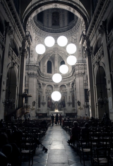
Light Projection
Easy web are a light projection specialist, their work interacts with the buildings its projected onto.
Chunky rice
I am currently reading Craig Thompsons Goodbye Chunky rice. What I enjoy most about his work is the transistions between scenes it plays just like child hood imagination and this is something I am trying to capture on the book breif.

Thursday, 8 November 2007
Planet terror
Saw Planet terror last night, im still a little annoyed at the way i never got the real grind house experiance, and I had to see the films cut in half, but it was alot of fun, everyone in the audience was laughing and having a good time, this is what cinema should be like. Not sure about the guy from lost going around collecting peoples balls tho, but any way this was really entertaining, and i loved death proof very different films,Planet terror aimed more for the Grind House style i personally felt, and the legend Tom Savini was in it which made me happy.
Jeffrey brown Documentry
Just bought tickets to go see the jeffrey brown documentry at the leeds film festival, im really excited as I i have loved Jeff's stuff for a long time now and im so glad he has made it, and can say he makes comic books for a living.
Drawing Between the Lines Trailer
Add to My Profile | More Videos
Drawing Between the Lines Trailer
Add to My Profile | More Videos
Wednesday, 7 November 2007
Where the wild things are
My favorite child hood book is a big basis for my current collection project, Maurice Sendrik was my favorite children's author when i was younger. His work always made me feel that as children we can achieve amazing things in an adult world.
Gertie and Berlin
When i went to Berlin, not only did I see original Ray Harryhausen figures, I discovered the gertie the dinasour the 1921 animation. Ive always been in love with any forms of animation and I am keen to carry on exploring older forms of animation.
Neil Blomkamp
He was going to make the Halo movie but who cares, his body of work is amazing mixing a news reel sci fi documentry feel to his work, machines and organic qualties collide together.
Meeting Shrigley
So i met David Shrigley a major influence upon me, he also showed us new animations from the Slinky Pictures, a place i really want work experience with, they are a company who do exactly what i want to do and i am so excited about what they are doing.
Billy Collins
I am addicted to not only the amazing poems of Billy Collins, but this style of animation.
A major influence on the collection breif.
A major influence on the collection breif.
Bar Rectum
While you’re there be sure to check out some of the other fantastic places to visit like Bar Rectum (”While BarRectum is anatomically correct, the last part of the large intestine has been inflated to a humongous size to hold as many drinking customers at the bar as possible”), and the Wombhouse (”One ovary contains the minibar; the other the toilet”).
The nines
Ok so it has ryan renolds in but it looks really really good, and apparantly according to empire he can act? Well i did like two guys and pizza place but this is adult donnie darko
Street Sketch Book

Just bought this book for £16 at borders yesterday I really recomend it to anyone who has any vague interest in grafiti, sketching doodling etc.

Tuesday, 6 November 2007
EAGLE VS CONCHORDS
I am currently addidcted to Flight Of The Conchords, its a TY show from the guys behind Eagle vs Shark.
SIGOR ROS
On Saturday we went to see the sigor ros film, it was amazing, Shot entirely on HD Cameras. The experience was up lifting and inspiring, the only thing that let it down was the fact you could here the music from a house party next door to the cinema.
Monday, 11 June 2007
ok
so ive decided to run this blog on after the web elective class because im always getting stuff i find on the net as an insipration and it would be nice too just have it all their when im feeling a lil blue.
ok lets get too it.
what i cant wait for is this
30days of night the comic book is awesome and the film looks really good too
plus ben templesmith's work is great, i just love the texsture of his work, and the layers hes been using with photoshop, i really want too push my animations with more texture to them.
I also got a limited edition jeffrey brown card as well :)
. i really need to get my cv out get some shit bar job while im at uni, i really want a job where i get to just sit their and draw and drink ink while im at uni, but alas i probally will have to serve people drinks.
Thursday, 31 May 2007
link :)
..
>
Eval
I feel I have completed the task extremely well, a lot of the website I spent a lot of time on my own trying to figure out and I am really glad that I have done this, as this has developed my skills in understanding HTML as I have begun to edit the entire site from code rather than on dream weaver, repairing links when people have said they are broken, and adding more information.
After completing my site, I began to realize during the process of uploading it that I really needed too order my files correctly and separate my Photoshop files and my html/jpeg files, this would make the whole process of uploading the images a seamless process.
One aspect I would definitely change of my website is the position of it, I would prefer it to be more central as it seems to stray a little over to the left, and this makes the page look like there is more too it than there is.
The update section also needs to be changed, I want to put a header above it that is a graphic that highlights it’s the ‘news section’ and then put a background within the DIV tag scroll bar, I have begun to scan in lined paper with splats of ink on it, as I feel this part looks a little bare in comparison to the rest of the site.
Another aspect that I am thinking of changing is adding words over the video section which some up each individual video as I am not entirely sure if it communicates well enough that each thumbnails is a video, this has not come up during audience testing most people complained about the double click option I put on everything, this really did throw people off and people said it didn’t work, I rectified this which resulted in viewers being extremely happy with the way the site runs.
In the contact section I am still undecided as too what to do with the text to the right as it feels a little clumsy at the moment, there is perhaps other sections that I am going to put in their such as a forum or a guest book something to where I can easily keep in touch with viewers of the site and they can let me know if there are any problems with it. This will enable me to create a better quality composition on the page and will compliment the image to the left.
When clicking on ‘contact’ it needs too say email in order too clearly state its purpose as at the moment the image just pops up and its unclear about whether or not you can click on it.
A splash page is something that I wanted to do after the web elective was over as I wanted to just get the structure right. The splash page would consist of an animation and given the time constraints I didn’t want to just come out with one page and nothing else, for this page I am going to start designing a flash animation which will set up the theme of the website.
Overall I feel I have achieved my initial aim which was I wanted to create a site that was extremely easy to update and navigate around, there are still a few objects that need re-arranging and I need to scan/print and upload the rest of my portfolio.
fag packs


with the smoking ban comming upon us i thought cig packets would be the perfect platform to advertise my website on,as they will become an increacingly odd thing too leave in a bar, so i propose too make the nets of a cigerate packet into characters this was only a prototype as i think i was drunk when i was making it, but it deffinatly can be done.
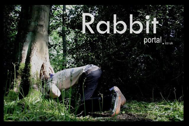
yoda yoda

another idea im going too use too promote involves plant pots, and plant tags, im going to put them everywhere with the web adress on the back but im going to do some quality vector based rabbits that go inside plant pots that are in art meauseams and coffee house peoples gardens everwhere where their is soil.


ive been doing these beer matt doodles for a long time now, and i figure they would be the perfect chance too promote the site, by having the address on the back and a little number too make them part of a collection, then i will get the finder to send a pic with them and the beer matt. these will go in the beer section, everytime i go into a bar im going to leave them on a table.

I asked a few people if their the website was working fine, and most agreed that they could see the whole thing, i know that i need to shift the box more to the centre as at the moment its too far too the left

i also realized that the freind section wasnt working correctly this was because id entered the worng link i didnt put http:// before the address which resulted in the link being faulty.

probally the biggest pain so far, has been uploading the website, everything was running fine until it came to going to www.rabbitportal.co.uk , the website company hosting my site kept comming up instead of my site. Their wasnt really a massive problem inb the end all i had to do was to change where the site would open up so instead of www.friedice.freebitty.com it had to be the index page it was set too.
At the moment im currently having problems making changes too the double click's on the website, as that has been the biggest complaint so far, i guess i was thinking of me instead as i useually tend to double click everything. this shouldnt take too long as its only the photography page and the illustration section oh and the video one that have this problem.


i wanted to create images for the site, this is only temp but ive decided to use this as an image for my contact section and then along side this im going to create a link that opens up, but i really dont want the terrible underlined blue text to come up with my email ad so im working on creating a pop up to come up on that page, which will have an image, i figure all you have to do is insert the image code in between the link html and this should work.


you can see here where i have changed the code to open an image which will then send you to your default email browser, from here people can either send me an email or copy and paste my email adress

i also i had to resize the browser window so it would fit the size of the image, im wanting to create a black border that will match up to the image.

I wanted to create a nav bar which refelcted not only the websites name, but also i wanted to create something that would reflect my work, and i feel i did this extremely well here, its basically i photoshop file of 2 layers one is of a hole within a tree and i layerd a ripple on water over the top of this.
then added a tittle to this i did various different versions of this, However i felt that this was an extremely good representation of what i am about. I really need to change the apostraphe after in 'Present's' but ive already over laid it onto every page and i dont really have time to change this on photoshop.
NAV BAR


To begin with a started to create the nev bar entirely within image ready, i had two of the same bars and created roll overs and the links within image ready, so everything worked their and all i would simply have to do was insert the code into my dream weaver document. this however didnt work the nav bar would come up but the roll overs did not.


On photoshop i created a nav bar again that had already been sliced via image ready and i created two of the same nav bar one with white text and another with the opacity turned down. At first i encounted some problems with the quality of the graphic as it looked slightly gltichy and the quality was generally poor, so i changed the font to crisp and sharp, this gave it the quality i was looking for. from this i would insert the white nav bar into a table on dream weaver.so i could put the seperate sections up close together without their being any white gaps in between. and then set each sections link up so home would go to home etc.

using the image swap, which i talked abou earlier in the blog i used it again with my illustation section. I had encounterd a few problems to begin with, as the images were all the complete wrong size.

I went back into photoshop and changed all the image res sizes too 72, this was a complete pain but it also gave me the change to convert my images from layers into tables, this became a much easier way of arranging my images.
video swap

I wanted too post my video's on my website, however knowing that i would only be able too obtain a 5gb web space, i knew that i would have to use and alternative site that would host my videos. The obvious choice was to use youtube as it is quick and easy too use and its easy to acsess.
However i didnt want to have a dreict link to their site or have their nasty front cover thhat shows up before your video plays, so i created a new hmtl window, and used a image from the video, and upon click this would open up a pop up window whcih was the exact size of the video without taking the viewer away from the web site.


Thursday, 26 April 2007

The DIV tag is something i have no idea how to create, i wanted a quick and easy way to update the site, within a confined space so can keep a constant list of updates, and keep the viewers up to date with what i am doing.
I had to cheat a little bit in order to get the the Div tage, by swiping someone else's code but by doing this it gave me better understanding of how the HTML works, as the code i got didnt fit the page, so i had to re adjust the code width and change the width so i wouldnt get a horrible over flow on the bottom.


I am currently playing with the border along the top, and have started to play with what it is id like to highlight that it is the news section. I also want to create a back ground using the css style sheets, this is how i created the txt too change itss size and height.
Wednesday, 25 April 2007
Swap shop

I experimented with creating the desired effect that i am going to apply to both my photography section and illustration section in dreamweaver
I had to create smaller and larger versions of the images and import them all into the root folder, once this was done i could apply 'Image Swap' at first it worked but it was mearly an image swap i wanted the image to stay still on the right and it would only go away when you clicked on another item, to do this you simply change the actions on the mouse too on 'double click, swap image'


At first i just wanted this style of navigation just to be within my photography section, but as i began to do more research i learnt people had used this style for the whole site, and its better to have a site that flows. I began to experiment in class with image swap in class, but i wanted the image to stay on click and would disappear when clicked off.


I began to design how i would want my site too look, as i didn't want a chaotic mess that was bombarded with animations, i want my site to be simple and elegant. This will enable the viewer to go over the site in a professional way, and let my work express what i can do.
Above i have the main page where it has a basic six or seven box's that have the same links as those above, just under the banner (the banner will be on every page, as too will the navigation bar). In the bottom right i want to have a scrolling device this is where i will insert updates, such as 'new illustrations' then explain some of the work etc.

the bottom right is a more clear view of how i want it too look, stylistically i haven't really got around to making a clear choice of what i want.
Thursday, 29 March 2007
matt sewell

Matt Sewell's page is exactly the type of site that i would like to make it is easy to navigate, the color's that make up the site are inviting and calming as well, but it still retains Sewell's style.
it doesnt have a scroll bar!! I have become quite obsessed with the notion of no scroll bar as they are a pain, you dont wont to be scrolling your finger down endlessley to get to the bottom of your page, the page i feel should presented as something that snaps to your screen.


His photographs of his work are spaced out into individual squares which then pop up into a new framed window with the navigation banner above, i would prefer to have my mine images appear on the same page, like an image swap, this enables people to view the images at a nice size without them getting the full image so they cant just print it off.
Subscribe to:
Posts (Atom)
